
Neutral home decor ideas for calm space work best when they feel warm and intentional, not like you erased all personality from the room. If your “neutral” attempts keep reading as bland, sterile, or oddly unfinished, you’re usually missing contrast, texture, or lighting.
The good news is you don’t need a full renovation or a celebrity designer to get that calm-home feel. Small choices, a tighter palette, and a few repeatable rules tend to do more than buying a cart of beige decor.
I’ll walk you through why neutral rooms sometimes go wrong, how to choose a palette that feels soothing in real life, and what to actually buy or swap first. You’ll also get a quick table for picking neutrals by room, plus a checklist to keep decisions simple.
Why “neutral” sometimes feels cold, boring, or chaotic
A calm neutral room usually has quiet color, but it still has structure. When the space feels off, it’s often one of these scenarios.
- Everything matches too closely: Same beige on walls, sofa, rug, curtains, so the room loses depth and looks flat.
- Undertones are fighting: Warm cream beside cool gray can read dingy, especially under mixed bulbs.
- Too few textures: Smooth fabric, smooth paint, smooth surfaces, your eye has nothing to “rest on.”
- Lighting is doing the wrong job: Harsh overhead light can make neutrals look grayish and tired.
- No anchor pieces: Calm doesn’t mean no contrast, it means controlled contrast.
Pick a neutral palette that actually looks calm at home
Neutrals are not “one color.” The calm effect comes from choosing a tight family of tones, then repeating them across the room. If you want a shortcut, start with one wall neutral, one textile neutral, one wood tone, then add a small accent (black, bronze, or muted green works well).
Start with undertones (the part most people skip)
When you compare paint swatches, look for the hidden cast: warm (yellow, red, peach) or cool (blue, green). Many “greige” colors can flip depending on light, which is why they look perfect in the store and strange at home.
- Warm neutrals: cream, ivory, sand, camel, warm taupe, honey oak
- Cool neutrals: soft white, stone, cool taupe, light gray, ash wood
- Balanced neutrals: true beige, some greiges, natural linen tones
According to the American Lighting Association, layered lighting improves visual comfort; in practice, it also helps you see undertones more accurately across day and night.
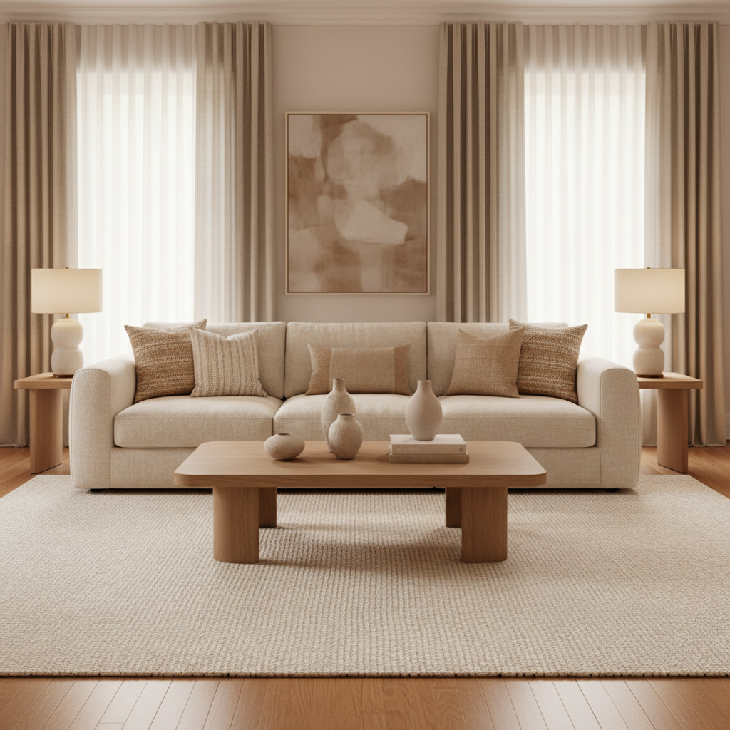
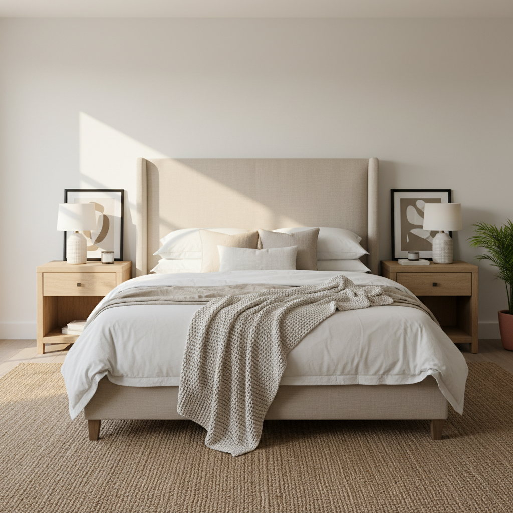
A simple room-by-room neutral plan (use this table)
If you’re overwhelmed, follow a room formula. Keep your biggest surfaces quieter, then layer detail through textiles and finishes.
| Room | Calm base color direction | Best textures to add | Small contrast that helps |
|---|---|---|---|
| Living room | Cream or warm greige | Wool rug, linen curtains, boucle or knit throw | Matte black frame or bronze lamp |
| Bedroom | Soft white, oatmeal, sand | Cotton percale, quilted coverlet, sheer drapes | Dark walnut nightstand or black hardware |
| Kitchen | Warm white cabinets, light stone | Wood cutting boards, ribbed glass, woven runner | Mixed metals kept to 1–2 finishes |
| Bathroom | White + light taupe/stone | Waffle towels, natural bath mat, ceramic tray | One darker grout or matte fixture |
| Home office | Light greige or soft white | Felt pad, textured shade, woven basket storage | One grounded element (dark chair, black shelf) |
Fast self-check: what your calm space is missing
Before you buy anything, run this quick diagnostic. You’ll usually spot the issue in under two minutes.
- Undertone check: Do your walls read warmer or cooler than your sofa or rug?
- Texture check: Do you have at least 3 different textures (rug, curtain, throw) within the same palette?
- Value check: Do you have both light and medium tones, plus one darker “anchor”?
- Shine check: Too many glossy finishes can feel busy; too many matte surfaces can feel dull.
- Clutter check: Calm neutrals show visual noise more easily, storage matters.
Key takeaway: If your room is neutral but not calm, it’s usually a contrast problem, not a color problem.
Neutral home decor ideas for calm space you can do this weekend
These are practical swaps that tend to change the mood quickly without forcing you into a full redesign. Pick two, do them well, then reassess.
1) Layer textiles, not more “stuff”
- Upgrade to a larger, more textured rug (wool, jute-wool blend, or a low-contrast pattern).
- Add curtains with visible weave, even if they’re a similar color to the walls.
- Use a throw + 2 pillows in slightly different tones, not identical beige.
2) Choose one quiet pattern
A subtle stripe, tiny grid, or tone-on-tone botanical can add life while staying calm. The trick is keeping the contrast low so it reads soft from across the room.
3) Bring in one natural element that feels “real”
- Light oak, walnut, rattan, travertine, ceramic, or linen all work.
- If you do greenery, pick one larger plant instead of several small ones.
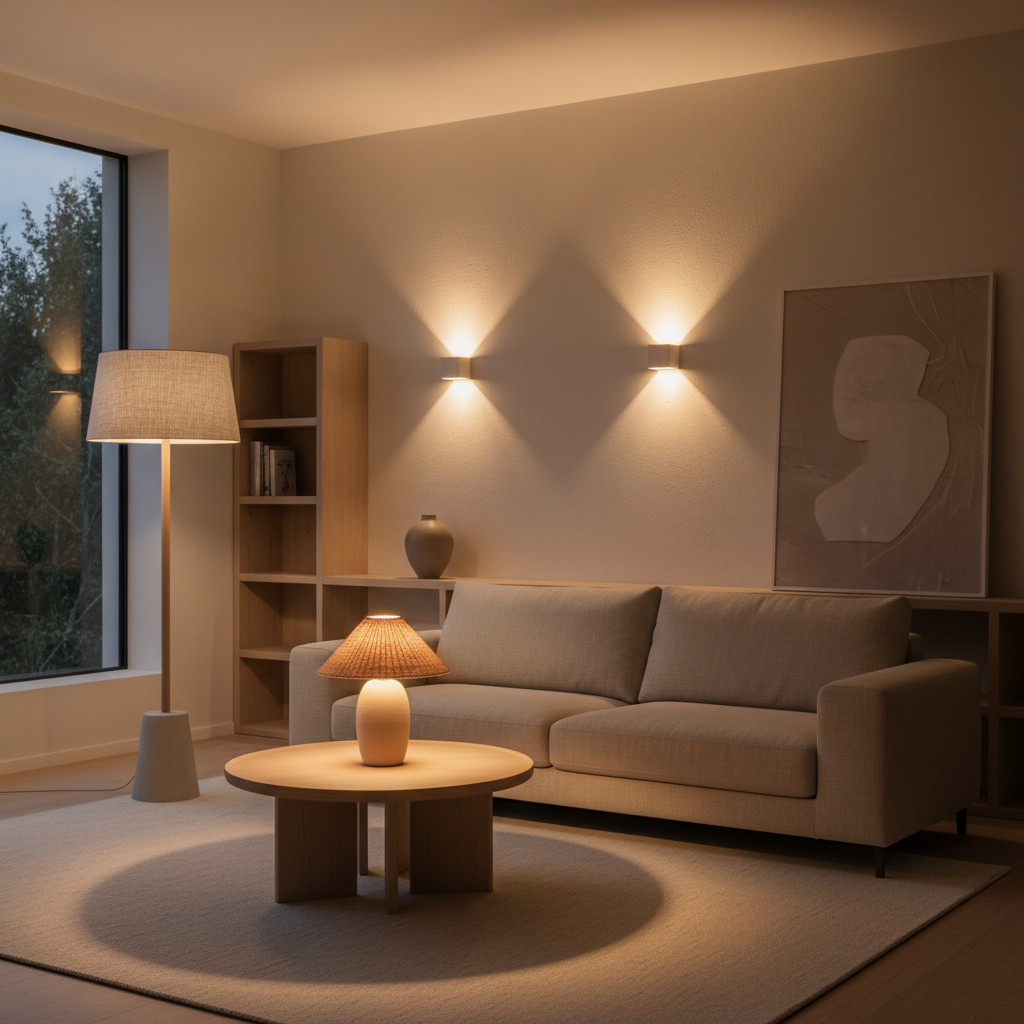
4) Add lighting layers with warm bulbs
A common calm-space upgrade is moving from one ceiling light to a mix of lamps. In many homes, 2700K–3000K bulbs feel warmer and more relaxing than cooler temperatures, but bulb choice can vary by room and personal sensitivity.
According to the U.S. Department of Energy, LED lighting uses less energy than traditional options; switching also makes it easier to choose consistent color temperature across fixtures.
Common mistakes to avoid (they look minor, but they add up)
- Buying decor before fixing the big surfaces: If the rug is too small or the curtains look flimsy, accessories won’t save it.
- Mixing too many whites: Bright white, creamy white, and gray-white can clash in one sightline.
- Overdoing beige: Calm needs breathing room, not a monotone fog. Add wood, black, or a muted color.
- Ignoring scale: Tiny frames, tiny vases, tiny pillows can make the room feel restless.
- “Showroom styling” at home: Too many curated objects can create mental noise, even if every item is neutral.
When it makes sense to get professional help
If you keep repainting and nothing feels right, it might be your home’s fixed elements, not your taste. A designer or paint color consultant can help when:
- You have open-concept rooms where neutrals must flow across multiple zones.
- Floors, countertops, and cabinets have strong undertones that limit paint choices.
- Lighting is complex (little natural light, mixed bulbs, or unusual ceiling height).
- You’re sensitive to glare or want a calmer setup for focus and rest; for health-related concerns, it’s reasonable to consult a qualified professional.
Conclusion: calm neutrals come from structure, not perfection
The most livable neutral rooms aren’t all beige, they’re consistent in undertones, rich in texture, and honest about contrast. If you want a clear next move, pick a warm or cool direction, fix the rug-and-curtains combo, then add lighting layers that flatter everything else.
If you try only one thing this week, make it this: take two photos of your room morning and night, then adjust one variable, either lighting warmth or textile texture. That’s usually where calm starts to show up.
Key points to remember
- Undertones matter more than the color name on the swatch.
- Calm rooms still need one anchor to avoid looking washed out.
- Layered textures beat buying more small decor every time.
FAQ
- How do I make a neutral room feel cozy, not bland?
Focus on texture and lighting before accessories: a substantial rug, woven curtains, and warm lamp light typically shift the mood fast. - What’s the easiest neutral color palette for beginners?
Warm white walls, oatmeal textiles, and light oak wood is a forgiving combo in many U.S. homes because it hides small undertone mismatches. - Can I mix gray and beige in the same calm space?
Yes, but keep undertones aligned. A warm greige with cream often works better than pairing cool gray with warm beige. - What accent colors work with neutral home decor ideas for calm space?
Muted olive, dusty blue, soft terracotta, and matte black can add structure while staying calm, especially when used sparingly. - How many wood tones are okay in a neutral room?
Usually two is comfortable: one dominant (floors or big furniture) and one supporting (frames, side tables). More can work if undertones match. - What lighting color temperature is best for a calming vibe?
Many people prefer 2700K–3000K in living spaces and bedrooms, but it can vary by preference and how much daylight the room gets. - Do neutral rooms show clutter more?
Often yes, because there’s less visual camouflage. Closed storage and fewer, larger decor pieces tend to read calmer.
If you’re working through neutral home decor ideas for calm space and you’d rather not second-guess undertones, rug sizing, and lighting choices on your own, a short consult or a room plan from a designer can be a surprisingly efficient way to get to “calm” without overbuying.